Houseof x Pickleson Paint.
In a brand new blog series brands we love, houseof are introducing you to some of our favourite independent homeware brands and designers. Here we have Alex and Rachael who are changing the paint industry, so keep your eyes peeled for Pickleson Paint!
We are so excited to have you feature on our blog! Tell us a little bit about yourselves, your brand and how it started.

Thanks very much, we’re excited to be a part of it! We’ve had a little bit of an unconventional route into the paint industry, which we hope is what makes us so different from other paint brands… Pickleson was founded and is run by myself, Alex, and my partner, Rachael - we’re a couple based in East London.
Rachael has spent much of her career working as a Social Media and Influencer specialist, creating strategies and campaigns for luxury brands online and is the reason we have (we hope) such a pretty instagram feed. She can also be credited with the fact we’ve had a really good rate of growth online for such a new company.

I have a background in film and graphic design, and have worked alongside some of the world’s biggest brands in the luxury, lifestyle and travel sectors, often with a focus on sustainability. I came up with the branding and designed the packaging. My role is mostly making sure that everything we create looks great and suits the aesthetic of Pickleson as a whole.
In terms of our route into the industry, we have family connections in paint and - as a result - we have always had a real interest in interior design. We decided that now is the right time to take everything we’ve learnt from our respective careers and do ‘what we do best’ to sex-up a pretty tired industry.
We have amazing, experienced manufacturing partners who have allowed us to create a range of colours that we believe are really modern and exciting, whilst not compromising on the quality of the product. We have a real focus on being truly sustainable - which isn’t easy in the world of paint - but our whole ethos is ‘sexy paint, made responsibly’... We don’t want our customers to have to choose between style and sustainability.
“...take everything we’ve learnt from our respective careers and do ‘what we do best’ to sex-up a pretty tired industry.”
Firstly, we love your name, there is something so nostalgic about it. How did it come about?
This is a bit cringe... but Pickleson is our ‘pet name’ for each other!
When I was testing out fonts and colours for our logo, I used ‘Pickleson’ as a kind of placeholder, to see how the lettering worked whilst we came up with a ‘real’ name. When I designed the first iteration of the logo as it currently is, we decided we loved the way it looked and couldn’t see the brand being called anything else. From the start we’ve said we never want to sound too ‘brand-y’ and want to talk to our customers the way we talk to each other, so in that respect it felt like a perfect fit.
Where do you find inspiration when coming up with new colours?
We’re mostly inspired by the tones and colours and we see when we travel. We spend as much time as we possibly can wandering around the Medditeranian together... Eating, drinking and generally taking in the colours and architecture in our favourite places. We hope people get a sense of that when they look through our colour range. It also goes a long way towards our colour names, which we know may seem a bit random at times!
We’ve also taken care to create colours from things that mean a lot to us personally. For example, our newest colour - Aegean Sage - was created from the cover of a cookbook owned by my dad… He was a great cook and when I went through his selection of cookbooks recently, we found the neutral, soothing, green our range had been missing. It’s a real privilege to be able to create something new from things that mean a lot to us.

Where is your paint made?
The paint (and all of our materials and packaging) is made here in the UK.
What has been your biggest hurdle so far in creating The Pickleson Paint Co.?
We’ve been quite surprised with what has ended up being difficult aspects of setting up Pickleson. The great thing about being a team of two is there’s no one else to appease which usually means having to water down ideas, and every decision has been our own (and in turn every success). I’d say the biggest hurdle has been managing material suppliers as this is definitely an industry that needs sexing up too… If anyone’s looking for a gap in the market to start a trendy new business in, it’s that. I’ll say no more!
What has been your biggest achievement since creating The Pickleson Paint Co.?
Being able to launch in the first place was a really big achievement for us. Obviously, starting a company is a tough thing to do at the best of times but we were really in the deep-end of getting the business ready during lockdown. There were so many reasons not to launch that it became a real achievement for us to get launched at all.
Since then, we’ve been blown away with the response we’ve had. We only officially launched two months ago (June 25th) and the interest we’ve had from people, businesses and other brands has been staggering.
In the real world, we’d have to say the biggest achievement so far is being specified by Fortnum & Mason. They’ve painted a floor of their London store entirely in Pickleson… which makes us feel kinda boujee.
We love your approach in creating beautiful paint that is sustainable. Can you tell us a bit more about it?
Apologies in advance for the length of this answer!
Our mission is to bring vibrant, sustainable paint to a new generation of conscious consumers in a way that brings as little harm to our planet - and our customers - as possible; without compromising on quality and we don’t believe our customers should have to choose between style and sustainability.
“...we don’t believe our customers should have to choose between style and sustainability.”

For a lot of businesses, using the word 'sustainable' can cover all manner of sins (sometimes literally). What we set out to do is create a paint brand that is truly sustainable. Many paint companies create 'sustainable' or 'eco-friendly' paint ranges. However, a lot of them still use oil-based ingredients in their recipes or use toxic masking agents in order to claim that their paint is odourless. On the other end of that spectrum is paint that is made from genuinely eco-friendly ingredients. This sounds great but in reality, it can mean the paint people put on their walls is, to all intensive purposes, a living thing... It means it is susceptible to mould and will need repainting pretty frequently. This obviously means a higher level of production, which in turn results in a higher carbon footprint at a manufacturing level; it also means the consumer uses more paint products, more frequently; turning the good intentions into poor results.

Our paint is water-based and as low in VOCs (volatile organic compounds) as possible, but is created using enough non-toxic additives to make sure that it is really durable and lasts a long time, meaning people need to paint less frequently. Our recipe also ensures that our paint dries quickly and doesn't smell, without the use of toxic masking agents. This, we believe, makes our paint truly sustainable. For us, it's about finding the right balance.
We don't live in a perfect world and there are environmental consequences to running a vast majority of companies; ours included (shipping being a major part of that). We believe that language around sustainability is sometimes confusing and often misused. This is why we describe what we do as 'Sexy Paint Made Responsibly'... What we are doing now and will continue to do is strive to make an excellent product in the most responsible way we can, knowing that we need to grow in a way that helps protect the environment and our consumers.
Which are your personal favourite paint colours?
As we've developed our range, our favourite shades have changed multiple times. Pickle Blue is a beautiful, rich colour and is a shade we've worked really hard to get right. In contrast, Sangria Pink is a light, blushing colour and matches our brand pink so holds a special place in our hearts. Hackney Gold is also a definite favourite.
Having said that, as we've been testing each colour, we've discovered that we really do love them all. A big part of the reason we have a small colour range is because we didn't want to include a single shade we didn't like personally... If we get the business right, we believe our consumers will understand that and appreciate what we create, more than if we were to supply an endless colour chart.
Lastly, if you could pair one of your paints with one of our lights - which would it be?
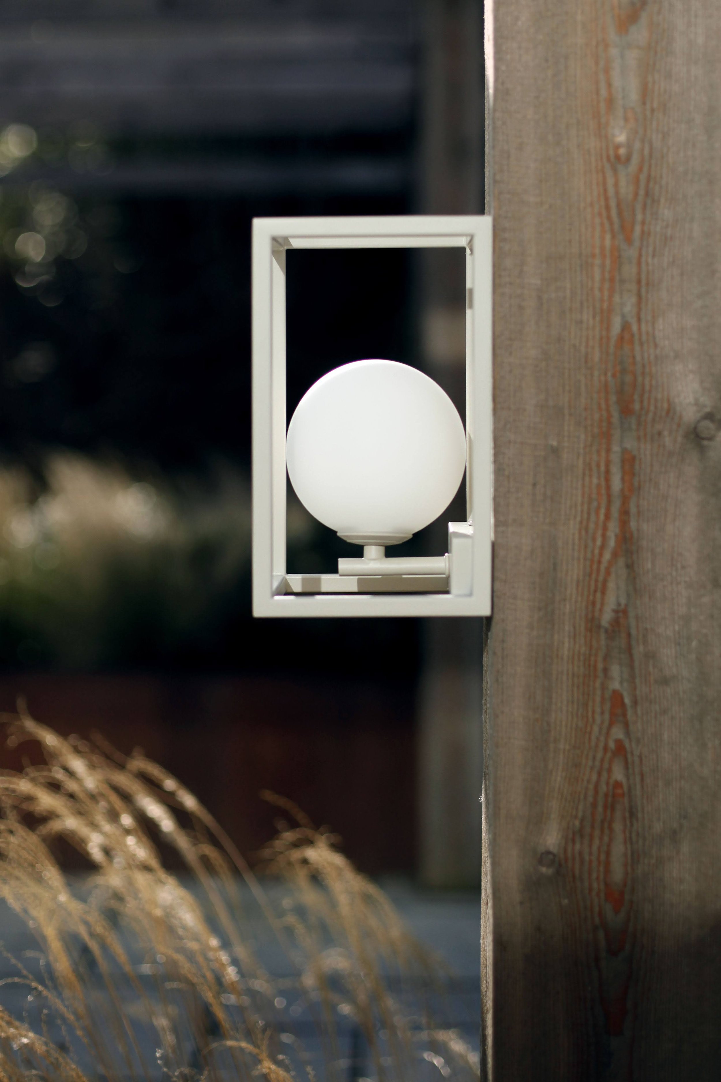
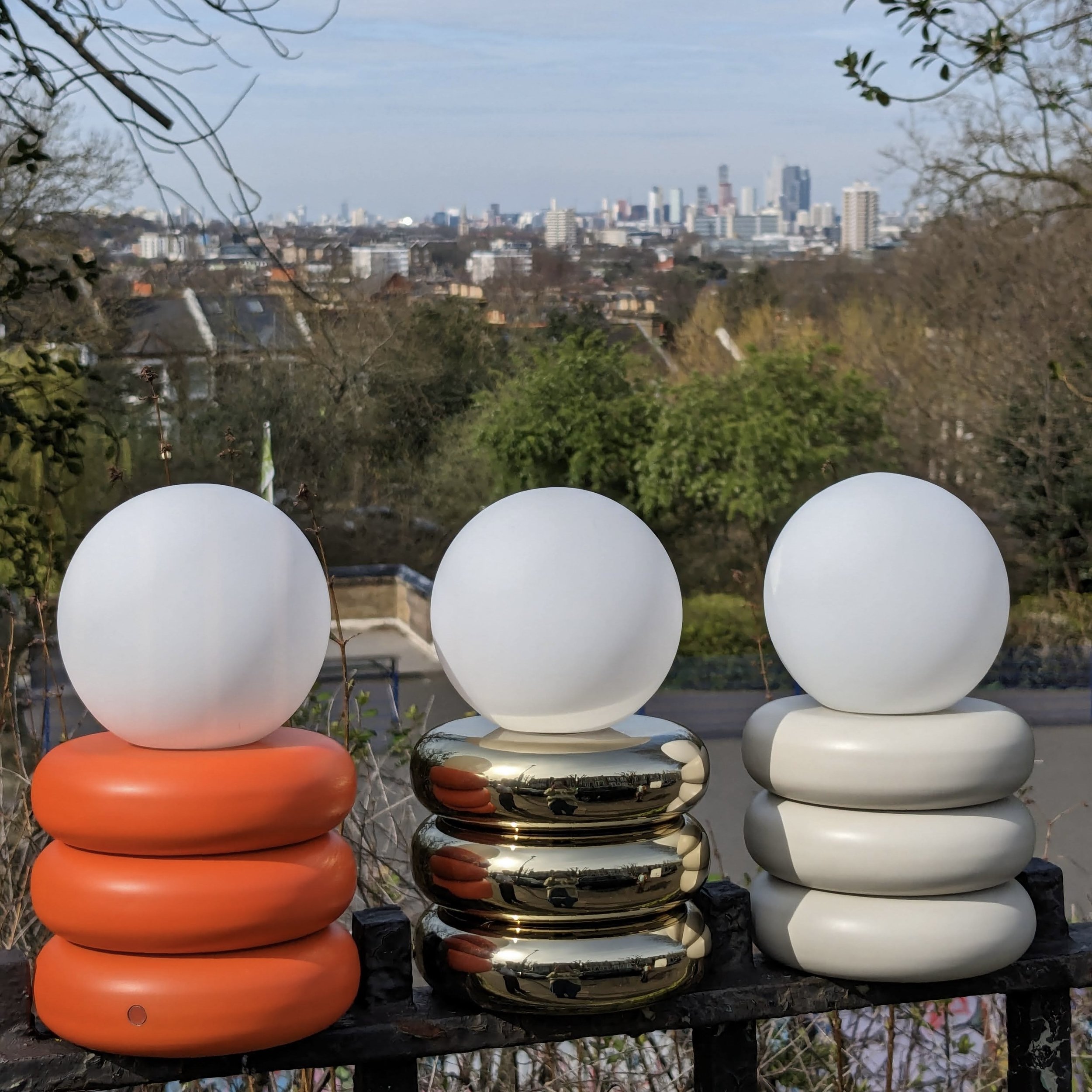
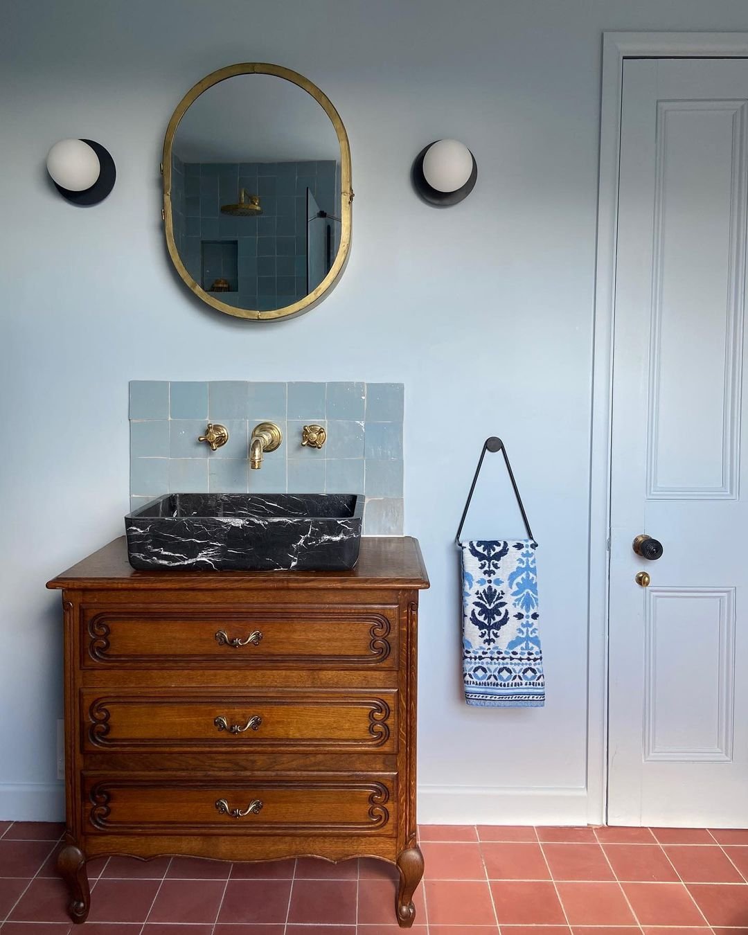
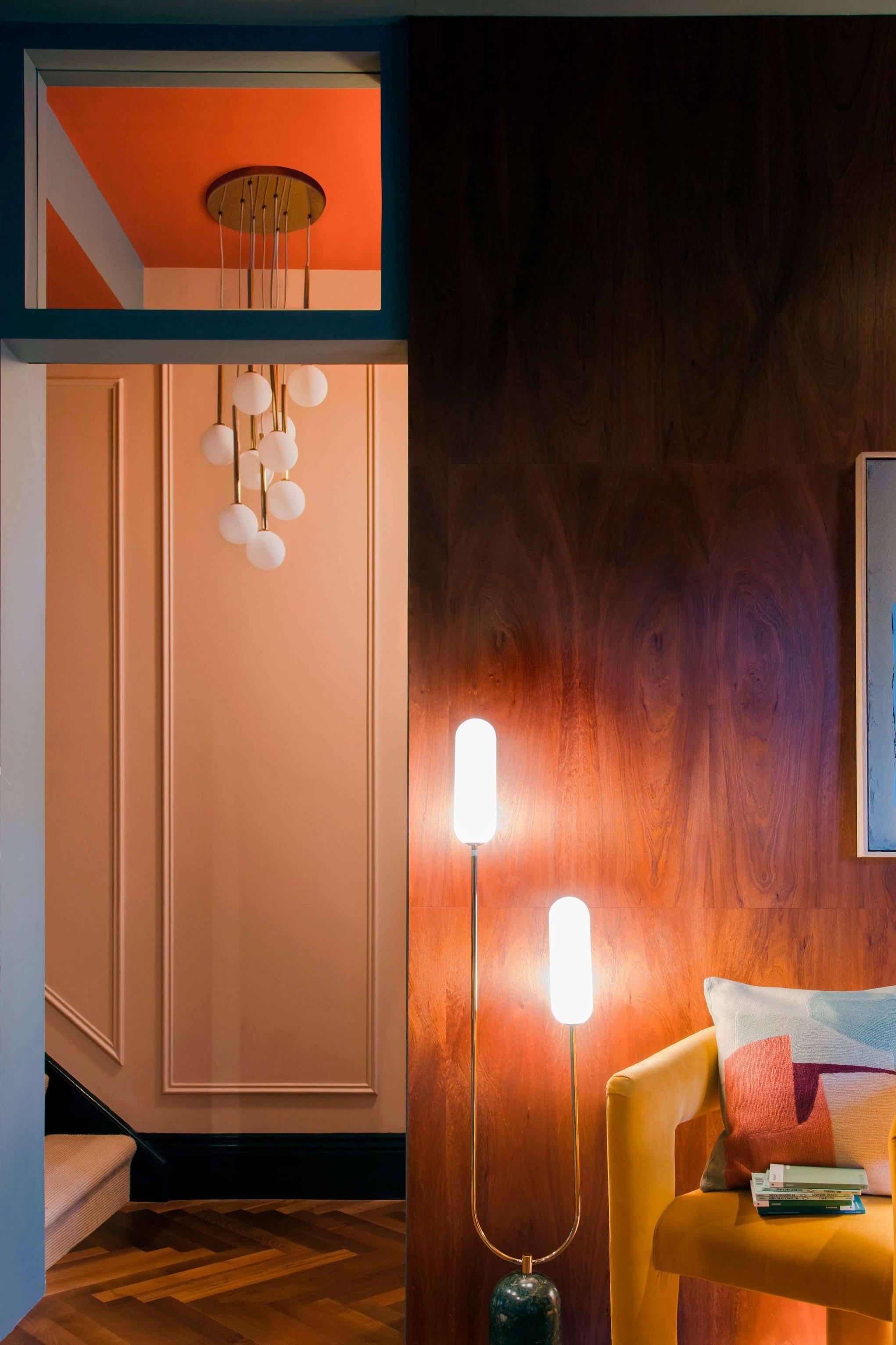
Any of them would look a dream together. We love the idea of contrasting your dark Opal Ceiling Lights with some of our more neutral shades or even pairing the charcoal one with a Jurassic Black. It’d look fierce and very, very satisfying. However, we have to say the pink curved opal wall light has our heart. If Pickleson was a light, it’d be that.